When you go responsive, it makes you focus on your top one to three primary goals. I can’t tell you what your goals are, but I can tell you how to make them clear in your next daily email newsletter design.
For a long time, the best email newsletters had a sidebar. We and all our publishing partners saw a large click-rate and revenue increase when each daily email newsletter featured just one product on the right-hand side of the email, in its own column. We’ve always stuck with the belief that the featured product should be aligned with the content of the email, like the one to the right.
But responsive design doesn’t appreciate column this, and column that, so about 6 years ago, we took our best-practice email template apart, and analyzed it.
[text_ad]
When we were done, there were a lot of parts left on the garage floor. Most notably: that right sidebar that had performed so well, for so long.
For Mequoda Daily, we plunged into a mobile-first single-column design, using a short one to two paragraph snippet, followed by a featured product right below it. After the switch to mobile-first, we had a 60% increase in arrivals from email.
That was a huge spike, and we’re sure it was partially due to this template being completely new. If our readers had banner blindness before, looking at our right rail every day, they no longer would.
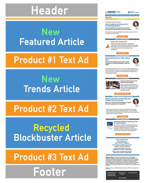
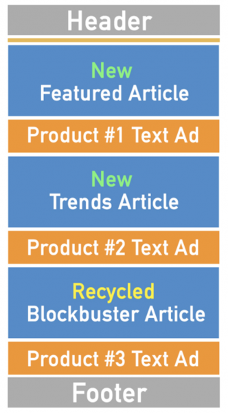
When we design mobile-first email newsletters, we focus on simplicity and thin width so that the content resizes easily on any size device. Below you can see what our best-practice email template looks like in its most simple form. It can be expanded to be much longer to include more types of content and more text ads.
For example, in the template below, you see three feature articles and three text ads. Two of the articles are new and one is a recycled blockbuster. However, many of our publishing partners recycle up to six blockbuster posts per day in their email newsletter stacks, and have six text ads for their products, which drive an enormous amount of revenue.

Our publishing partners have followed suit with similar results, though the content differs from one publication to the next.
One Mequoda publisher who made the switch from a two-column email template to a one-column mobile-first design saw a Revenue per Thousand (RPM) increase of 3.6x!
And click rates increase too. At Mequoda we saw rates increase by 27% after switching this stack format. Clicks to our most important ad went up 250%.
Since mobile-first design is easier to read and digest, more of the content, including your ads, gets seen.
All of our partners have completely different goals and products, so they use the stack as a template, and use it to fit their needs. The key to success in this template is sandwiching those text ads in between each featured article.
Here are examples of different publishers using the email stack template: New England Today, Bible History Daily, Negotiation Insider from the Program on Negotiation at Harvard Law School, and Food Gardening Network Daily. For a closer look, click those links. But from a birds-eye view, you can see that featured product ads are sandwiched between each featured article, and in some cases, a sponsor ad.

Every publisher has different goals and products, and their stacks are a reflection of their audience development and revenue generation goals. New articles, recycled articles, category pages, paid reports, free reports, and videos should all be in the order of priority within the stacked email template. The more content published per day, the more products you can promote in featured ad slots. You don’t need to publish three pieces of new content every day, most don’t.
If you’d like to talk to Mequoda about building a best-practice Mequoda System complete with email templates like these, driven by your goals, schedule a chat with us today.
What advancements have you made to your email templates that have made a big difference in clicks and conversions? Share in the comments below.
This article was originally published in 2015 and has been updated.


Comments are closed.