Increase open rates and save unsubscribes with insights from these weekly email newsletter templates
Many publishers believe in single-topic email newsletter templates in which every article of content is aligned around the same theme, in order to promote a related product. The exception to this rule is the weekly email newsletter template for subscribers who prefer to be contacted only once a week.
According to Harvard Business Review, the average worker receives 11,680 emails per year. It’s for this reason that people unsubscribe to email newsletters that no longer serve them. The best way to keep subscribers on a list they would otherwise unsubscribe from, is to offer them an opportunity to receive less email, delivered at a lesser frequency.
This is where the weekly email newsletter template comes in, sometimes called a week in review.
[text_ad]
Like most publications, you’re probably already sending out an email newsletter every day. The daily email newsletter gets you the most bang for your buck, because you have the chance to drop a subtle promotion or featured product in every email that you send. If you’re ad-driven, you might send out even more, since more deployments equals more revenue.
And you probably already know that a dedicated promotion for a product will work better than a daily email newsletter.
It’s like comparing a newspaper to a direct mail package.
You might happen upon an ad in a newspaper that you act upon, but you’re there for the content, not the ads. Easy distraction. They’re unlikely to provide you with enough info to pick up the phone and purchase right away.
When you open a direct mail package, you know exactly what you’re getting into and you’re going to get more than enough information to make a purchasing decision.
So, why then, would you ever want to send a week in review? A weekly editorial email may not give you as many opportunities to causally promote a product and generate more revenue—so why should you give your readers the option to subscribe to a weekly email newsletter?
1. Some readers don’t have a daily attention span
Unfortunately, many readers don’t have the attention span to open your email every day, but they might be able to commit to you once a week. Giving them the choice to subscribe to a weekly email newsletter means that you won’t scare away people with the fear of an overloaded inbox.
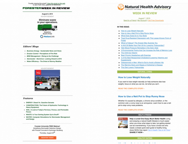
Here’s an example of weekly email newsletter templates from Forester Network and Natural Health Advisory. You can see how they’re implementing our mobile-first stack method, even in their weekly email newsletters.
2. Subject lines with dates and the word “weekly” get better open rates
According to several studies I’ve read from MailChimp, some of their top-performing subject lines are for weekly or monthly updates. They came in with open rates from 60-92% which is sort of mind-blowing when you think about it.
This is one of their top performing subject lines: Eye on the [COMPANYNAME] Update (Oct 31 – Nov 4)
When I did my own research using the MailChimp subject line research tool (only available to MailChimp users), they were able to tell me which types of weekly email subject lines get the best open rates:
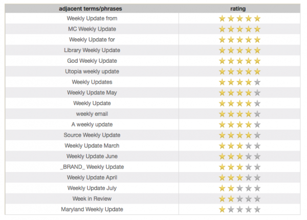 As it turns out, “week in review” doesn’t pull so great but “weekly update from” knocks it out of the park. Write that down!
3. You can save your unsubscribes
Notice that I haven’t even mentioned how awesome your content should be. This is because when people hit that moment when they see too many email newsletters in their inbox and start on an unsubscribing binge – it will hardly matter. Some people just have a bad day and start hitting the unsubscribe button like there’s no tomorrow.
That’s why you provide them with the option to switch to a weekly email newsletter when they try to unsubscribe. In fact, you probably want to provide them with an option to subscribe to you on Twitter or Facebook too just in case they really want to make it to inbox zero.
I went to my inbox to unsubscribe from a few newsletters to see how publishers were pulling this off.
Here’s an example of Martha Stewart, who you know we love otherwise.
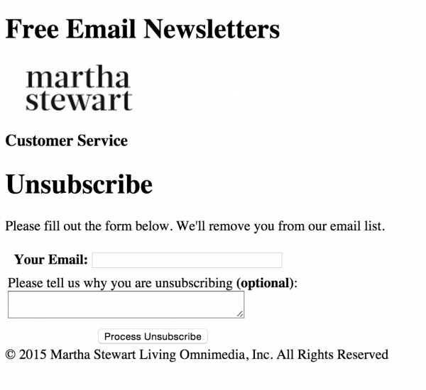
Despite Martha having plenty of email lists that her subscribers could opt into, this is the unfriendly but familiar form we see all too often. An open field and an unsubscribe button. Sadly, it encourages people to unsubscribe in a jiffy. This is the perfect place for a simple call to action that asks them to check off a “week in review” box. Also, include a couple social media buttons for good measure. If someone writes “I get too much email” in the “optional” box, I doubt anyone is following up with an offer to subscribe to something less frequent.
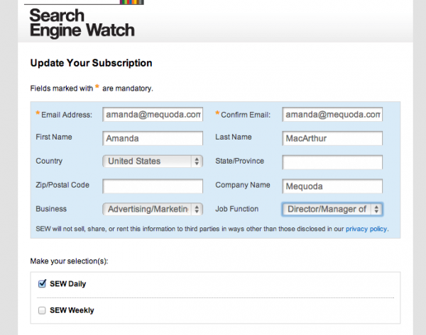
Search Engine Watch has the hang of it though. When the user clicks to unsubscribe from their email, they’re brought to this form where they can uncheck themselves from the list, or add themselves to the weekly list.
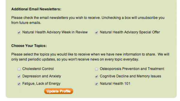
Mequoda Gold Member Natural Health Advisory, has done it right too. They’ve also allowed the user to add or remove themselves from additional topic emails.
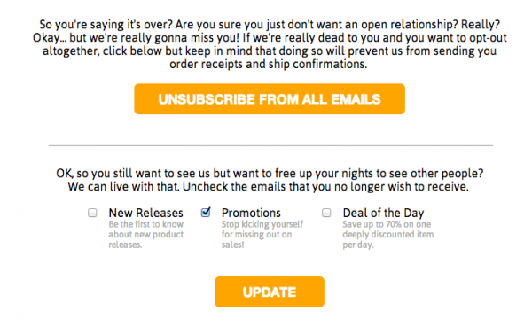
Although BustedTees.com isn’t a publisher, the format they have set up to either unsubscribe or choose a different list is beautifully laid out. In the publishing world, this makes it simple for readers to change their mind and check off a “week in review” box.
Sure, offering a weekly email newsletter might mean that some decide to opt into your weekly email newsletter instead of your daily one, but it also means they might opt into it instead of opting out. Which risk are you more willing to take?
This article was originally published in 2009 and has been updated.


