Which words are you choosing to convince people to join your email newsletter list?
When someone comes to your website, your first goal should be to get them on your email list. It doesn’t matter what you’re selling (or not selling), because you always want a way to keep in touch with them long after they’ve left your website.
In my curious research lately, I’ve been scouring the web for all the different ways that publishers and other industries are surrounding the “type email here” box on their websites and on their landing pages.
Does “Social Proof” really work?
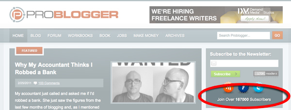
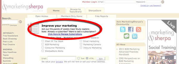
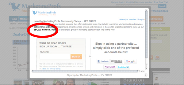
It’s debatable. The “social proof” method means that you’re asking people to be sheep by telling them how many other people subscribe, and insinuating that they should too. Some of the biggest online marketers use this method:
[text_ad]
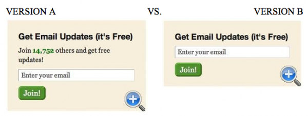
What’s funny, is that A/B tests will often surprise you. For example, this test submitted to Anne Holland at WhichTestWon.com, shows that “social proof” doesn’t always win.
You might think that “Join 14,752 others and get free updates” in version A below would pull better, but Version B, with no description, got a 122% lift in email opt-ins.
Holland explains that the reason for the lack of signups in Version A may be that “the messaging didn’t clearly explain what kind of email updates the subscriber would receive –- or the benefits of opting in.” In this case, less was more.
Another example from this site shows that The New York Public Library got a 52.8% boost by showing a graphic of the email newsletter in the signup form and said said “Stay up-to-date” rather than “Subscribe.”
Why people subscribe to email newsletters
People subscribe to email newsletters because they want something sent to their inbox. This is generally because they don’t want to keep coming to your website to stay updated, but would rather that you take the effort to update them instead.
That means that you need to give them a reason to stay updated. If you’re offering discounts in your email newsletter, you should say that in the copy that entices them to subscribe. If you send a week in review, so that they can get all your new blogs in one place, then you should be telling them that.
Here are a few examples of other publishers who are using this tactic:
To-Do lists work especially well for the Martha Stewart collection. By giving the reader one thing to focus on in a single email newsletter that will help them with the day at hand, they’re able to entice and inspire their readers.
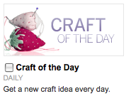
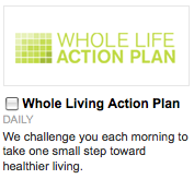
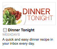
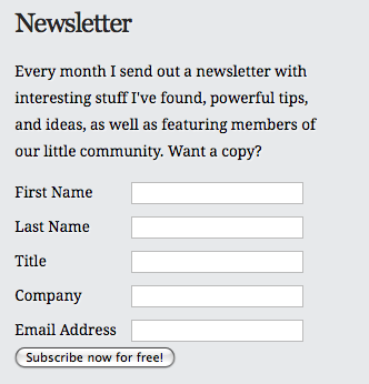
The personal approach might work very well for bloggers. Christopher S. Penn uses this method well:
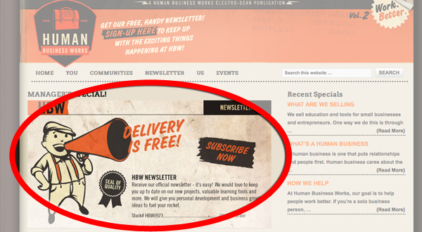
The aggressive but humorous route may also work. Human Business Works dedicates most of their space above the fold to getting people to sign up for their email newsletter.
OK so now it’s your turn. Have you conducted any tests on your own sites, or have examples on other sites that intrigued you? Let us know in the comments!


